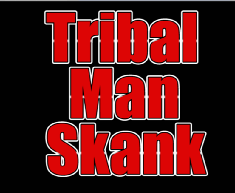
 The bold slogan 'I BE THE TRIBAL MAN' which I have used as the main text for my magazine cover is Tribal Magz' logo. Not only is this his slogan; it is also the lyrics for the sound track 'Tribal Man Skank'. I didn't use a photograph of the artist because UK Funky isn't recognise for the faces of the artists but rather the beat of the music.
The artist's name 'TRIBAL MAGZ' is red, bold and centered in between the word 'MAN'. I positioned the text this way on the editing software Photoshop to reinforce the fact that he (Tribal Magz) is a man. I laid out the magazine cover conveniently so that the most important details are visible to the audience, for example the month in which the music video will be released; 'OUT IN JANUARY'. The name of the font is Impact and I made it all caps so that it would stand out and my use of big red 'I' and white background creates a very strong contrast which would attract an audience to read it. A further analysis can be found (here).
The Front and back of the Digipack

The right hand side of the Album Cover ( above) in the back cover. I've chosen to use Tribal Magz' logo so that the blue and white background is In the centre of the the Album Cover, I placed a silhouette of women and men dancing. which I created with Photoshop to project positive vibes. I wanted to recreate an image of a flyer which promoters would hand out after raves. This is why I chose men and women dancing,depicting the night life in red because it bright and symbolises energy.It also creates an image of unison which will promote group participation. This links to the music video as the characters support each other in the opening scene where the teacher attempts to discipline the students. Most importantly they dance together by doing the 'Tribal Man Sank'.
'IT'S TIME TO GET FUNKY' is a phrase which is frequently used by UK Funky House lovers and ravers use, my target audience will immediately be captured by this phrase. I placed it at the top of the CD cover so that it would be noticed, as people tent to read from top to bottom and the font is coloured red and blank and it's all caps. The font which is used for 'TRIBAL MAN SKANK' on the Album Cover is different from the font which I used for the Magazine Cover. Even though there is a contrast between the fonts, the brand identity is secure for both the Magazine and Album Cover due to the colour theme of red,black and white are maintained. I created a silhouette of the artist Tribal Magz and I centered it between the dancers to show that he has the lead role, similarly to the photograph silhouette of the Inner Album Cover I placed the lead dancer in the middle of the other dancers. The silhouette of Tribal Magz not only links with Inner Album Cover, but they also link to the lyrics of the sound track 'I BE THE TRIBAL MAN'. He is a man of African decent who created the song. A high percentage of my target group as an audience will find the silhouette attractive and appealing because they are African also.
Inner Album Cover

For the inner Album Cover I created a mirror effect to the front and back covers. I started with with the blue and white motif background. I chose the colour blue to symbolise versatility and vibrance. If I wanted to modify the Album Cover I could change the background colour from blue to orange and there would still be a strong contrast between the colours. My target audience will still recognise the UK Funky House phrase 'ITS TIME TO GET FUNKY' which consists with the same font design as the front and back Album Covers.
The magazine also links to the inner album cover as the performers L.R Skankers' title is placed near the bottom of the magazine cover and it is also placed within the spine of the album cover. I decided to maintain the picture within the silhouette that I created to reveal the dancer who are the L.R Skanker, so the audience would know that the music video is based on school girls that like the sound track 'Tribal Man Skank'. However my entire target audience will not portray the Album Cover in this manner. They might think the image is of Tribal Magz' favourite fans.
The 'No DETENTION' sign is directly linked to the first clip that is seen in the music video, this is the message which I'm sending out to my target audience. Students dislike detention as they are restricted from their freedom, so this album cover shall surely appeal to them.